How to Create a Simple Report
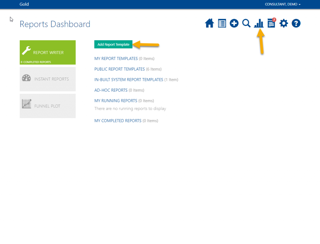
As well as the Public Report Templates and Instant Reports it is also possible to create your own private reports. The report data will export to excel in a table format to allow you to sort, filter, create pivot tables, format graphs and analyse the outcomes. These reports can only be run across one pathway due to the variation in forms across multiple pathways, you will need to create separate report templates for multiple pathways.
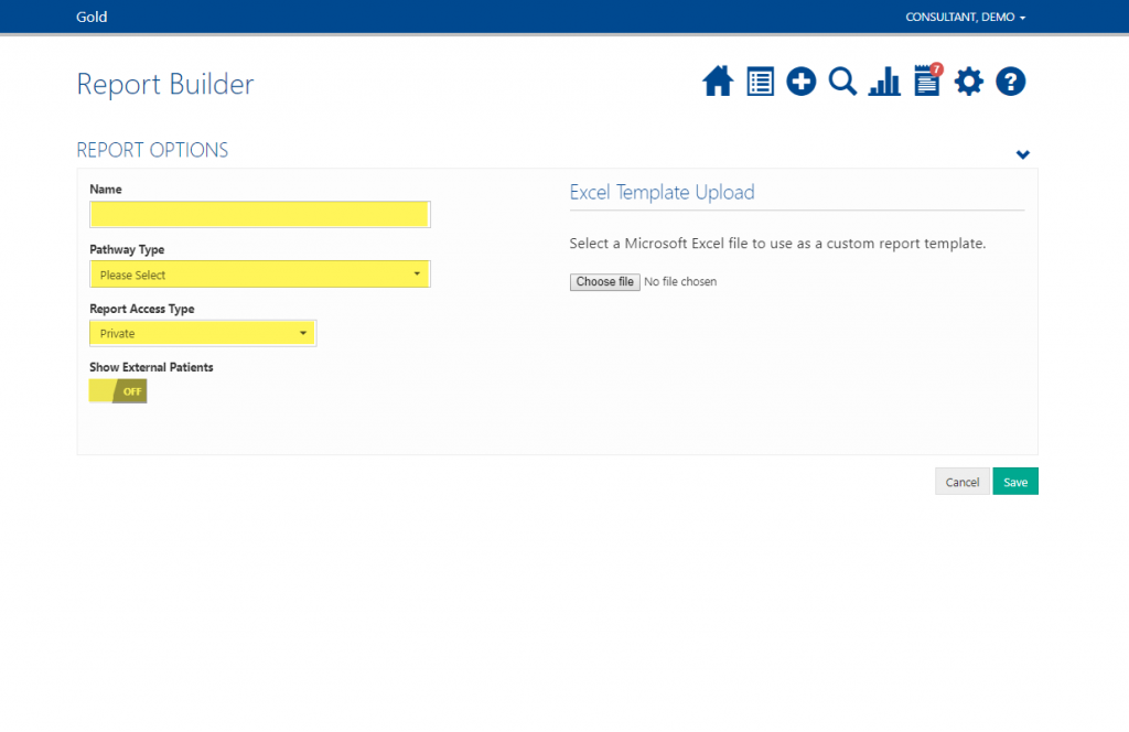
Name the report something meaningful to you and choose the Pathway Type.
If you would like this report to be available to all other users of the system change Report Access Type to Public.
Turn Show External Patients ON if you want to include those patients that have come through via data exchange. This is only relevant if you use a pro enterprise™ or pro one™ system.
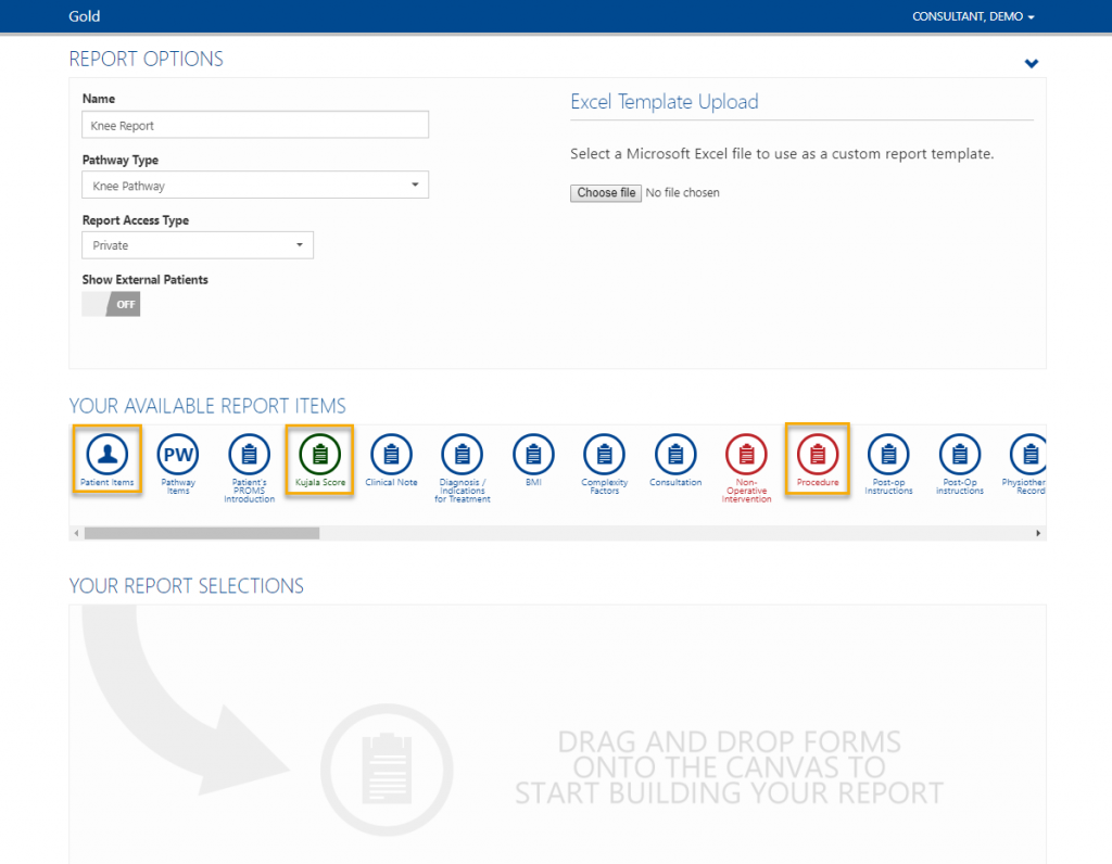
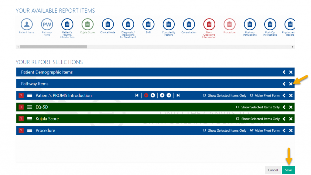
Once you have selected a pathway type you will see a selection of report items. Blue icons are standard forms, green icons are forms with score components and red icons are procedure forms.
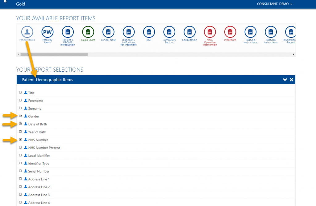
Click and drag the forms you require for the report onto the canvas below. This will open up a list of items within that form.
Tick the boxes next to the individual items you want to include in the report, each item you tick will be another column.
Please note: For international customers, ‘NHS number’ will return your default National Identifier.
Continue to choose all the items you would like to show in the report.
You can remove forms by clicking the cross on the right-hand side.
Once complete, click Save at the bottom of the page. This will now show in ‘My Report Templates’ and can be run at any time.
How to Run a Report
Reports can be run across any date range and for varius groups of people. You may want to run a report you have previously made, a public report or an ad-hoc report.
Please note: The reports server updates once a night. Any changes you made today will not show on a report until tomorrow.
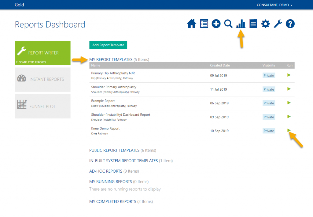
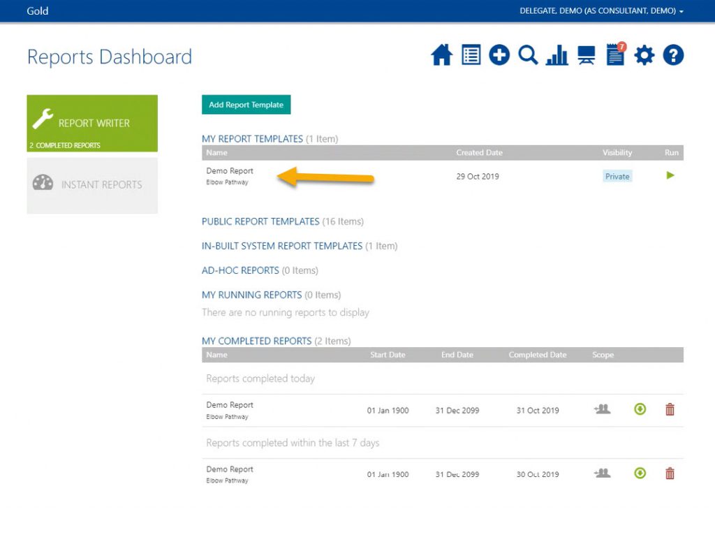
Find the report you wish to run. This can be a ‘Public Report Template’ or if it is one you previously built this will be saved in ‘My Report Templates’.
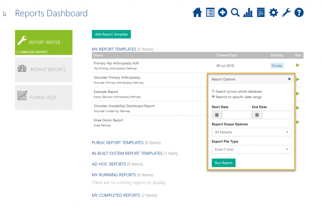
Choose the date range or search across whole database. Please note: this is based on pathway start date, any patients whose pathways started in that range will be included in the report.
You can then choose your report scope options:
- ‘My Patients Only’ – this will include only the patients whose pathways you are the owner of. This will not return any data for delegates.
- ‘All Patients I Have Access To’ – this will return all patients whose pathways you are the owner of and all other patients you have been given access to.
- ‘All Patients’ – this is only available to select users, this returns all patients on your Amplitude system.
- ‘All Patients of Users I Delegate For’ – will return all of the patients, belonging to all of the pathway owners you currently delegate for.
Then choose to export to MS Excel or save as a csv file.
Click Run Report.
If you have a 4:3 resolution monitor the report scope options window will appear facing inwards, towards the middle of the screen.
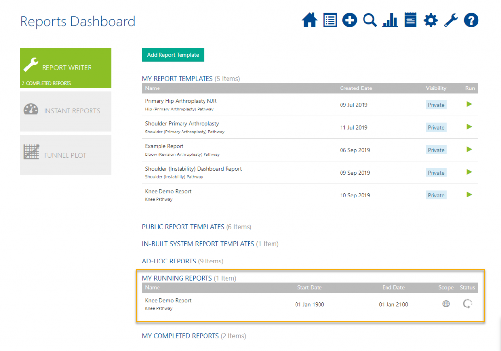
Whilst the report runs it will show in ‘My Running Reports’ with a spinning arrow. The time it takes to run depends on the amount of data in the report.
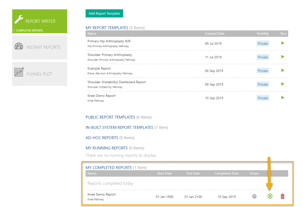
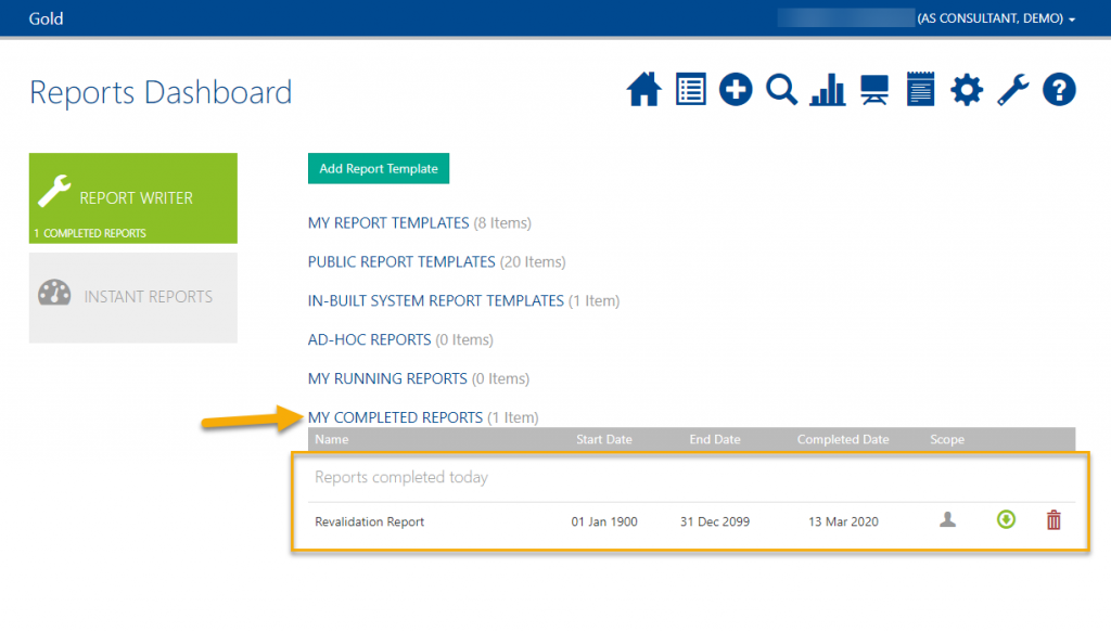
Once complete it will move to ‘My Completed Reports’.
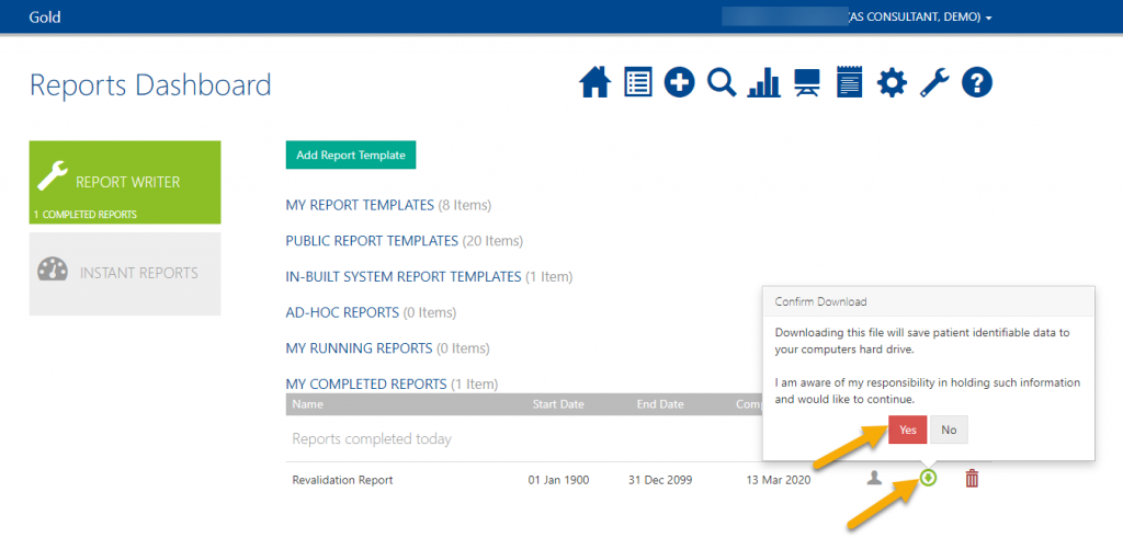
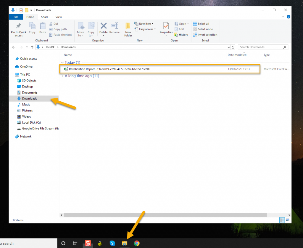
Click the green arrow and confirm to download the report. You will then be able to find it in your downloads folder on your computer.
You can delete the report by clicking the red trash icon.
Please note: The reports server updates once a night. Any changes you made today will not show on a report until tomorrow.
Extra Report Builder Options & Pivot Forms
There are a number of extra options in Amplitude’s Report Writer which will help you get the most out of your outcomes data.
Data Output Options and Re-ordering
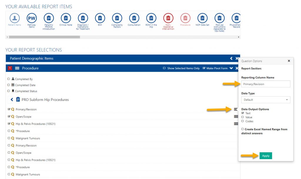
When ticking your report items you can change the name of the report items by clicking the three little lines and editing the reporting column name.
You can also change the data type and data output options. The data type will change the format for that column automatically when the data is downloaded. There are three data output options:
Text – This will return the word response the user selected
Value – If the questionnaire contains scoring, this will return the value associated with the chosen response
Code – If there is a corresponding code to the response, this will be returned.
Each selection will return in a separate column, entitled ‘text’, ‘value’ or ‘code’ to assist with data manipulation.
If you un-tick and re-tick the items these options will return back to the default.
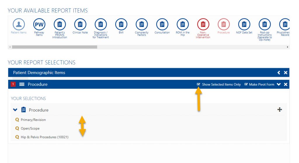
Another feature is to ‘Show Selected Items‘ only. With this ticked you can drag and drop items to change their order.
Amplitude Pivot Forms Explained
Making a Pivot Form allows you to choose which instance of a multiple instance form you wish to see on the report.
The Pivot Form is normally the procedure form however you can make any form the pivot. If you do not select a form to be the pivot it will default to the pathway start date.
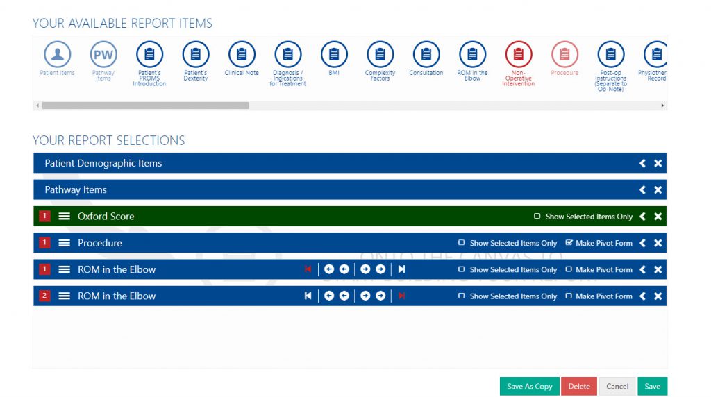
With a Pivot Form selected you will see various arrows on all other multiple instance forms, as shown below.
Note: Score forms do not have pivot options, all instances of the selected score will be shown in the report.
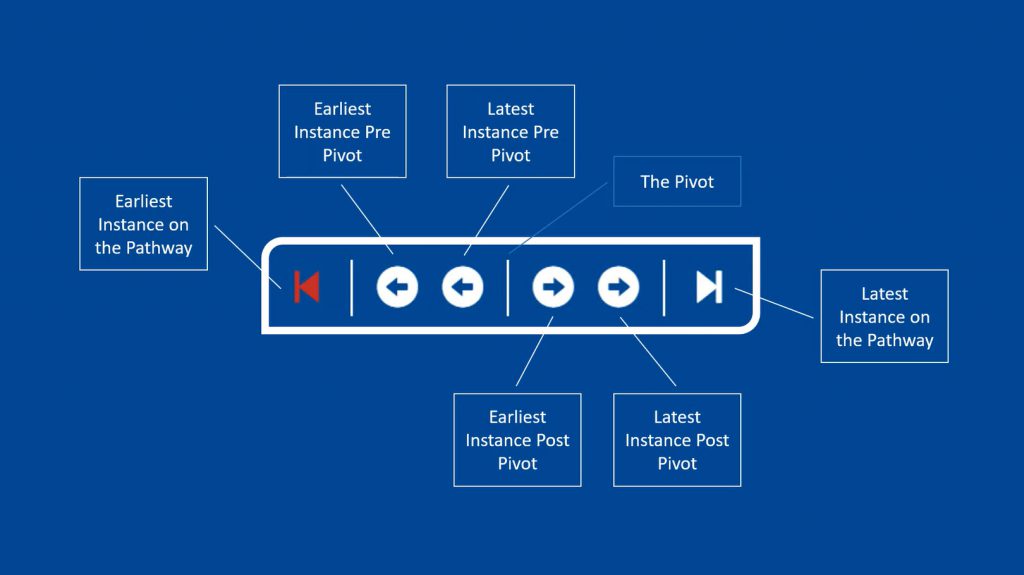
Make a Pivot Form: A pivot form is a form which all other forms can be chosen around. For example, your patients may have five completed notes forms on their pathways and to pick the one most relevant for your report, you would like to see their results pre and post op. By making the procedure form a pivot form, this puts a marker in at that point and allows you to pick which is pre-op and which are post-op. There can be more than one pivot form but only one pivot form of the same form type. For every instance of a pivot form, a new row in MS Excel is generated.
- Earliest Instance on a Pathway: This is the earliest point on the pathway that this form was given, regardless of when the pivot form was completed.
- Earliest Instance Pre-Pivot: This will take the selected questions from the form that occurred furthest pre-pivot.
- Latest Instance Pre-Pivot: This is the form closest to the pivot form before the pivot form was created.
- Post-Pivot options: These options are identical to their Pre-Pivot counterparts.
Instant Reports
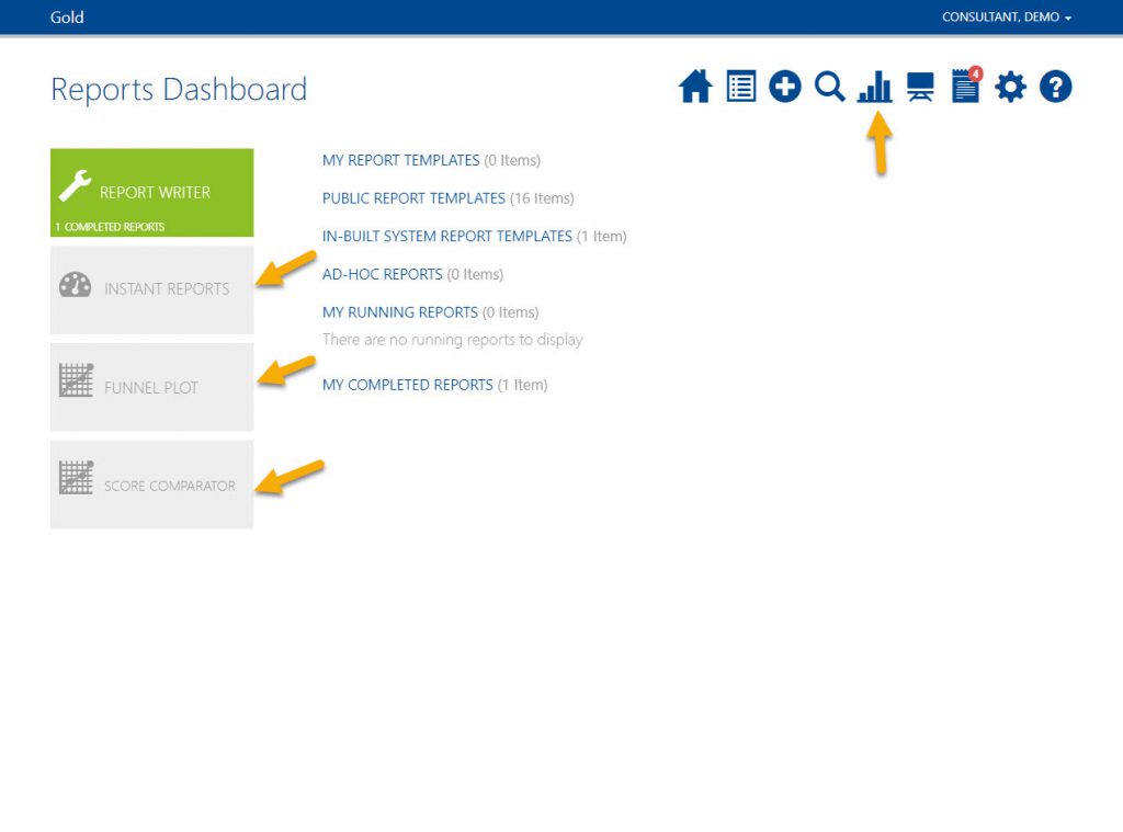
Instant Reports, Funnel Plots and Score Comparator are graphs that provide a brief, real time overview of your data. Unlike the report writer they update instantly meaning they include any information inputted today.
Due to the sensitive nature of the data, some of these graphs are only available to pathway owners.
Instant Reports:
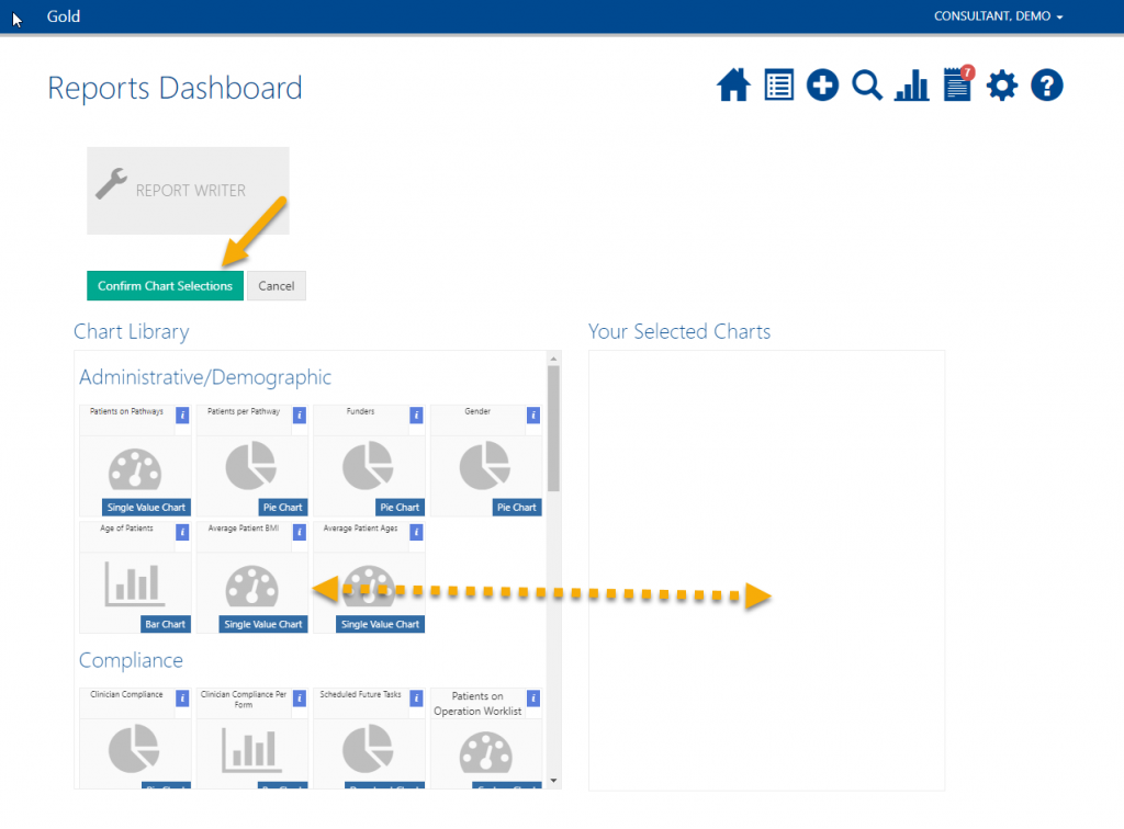
If configuring your Instant Reports for the first time click Configure Your Dashboard. Drag and drop the reports you require; these can be rearranged in any order.
Once happy click Confirm Chart Selection.
Now whenever you go to your Instant Reports these will load using real time data.
Funnel Plot:
Only available to pathway owners.
Choose the Score you would like to plot and which pathways to cover.
How is this calculated?
- Each consultants completed scores on a given pathway are cross-referenced against all instances of completed procedures on the same pathway. Pathways without a completed procedure are ignored.
- The latest instance of a completed score prior to the patients first procedure (a) is then selected along with the earliest instance of a completed score (and within the configured post-op date range) after the patients latest procedure (b).
- The score difference (d) is then calculated as: d = (b – a).
- The number of pathways with a completed procedure owned by the consultant is then calculated (n).
- The average difference (x̄) is then calculated as: x̄ = (∑(d) / n) to create the final scatter plot value.
1.96 is the approximate value of the 97.5 percentile point of the normal distribution used in probability and statistics. 95% of the area under a normal curve lies within roughly 1.96 standard errors of the mean, and due to the central limit theorem, this number is therefore used in the construction of approximate 95% confidence intervals. Its ubiquity is due to the arbitrary but common convention of using confidence intervals with 95% coverage rather than other coverages (such as 90% or 99%). This convention is particularly common in medical statistics.
Score Comparator:
Only available to pathway owners.
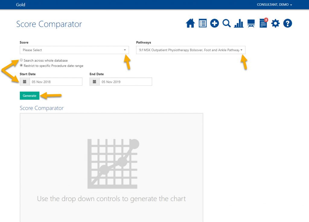
Choose the score you would like to compare and select which pathways to cover and choose a date range.
Click Generate.
Your outcomes will then be plotted against other consultants within your trust or registry system.
How to Upload Microsoft Excel Files to Report Templates
Report Writer has a functionality to add Excel files to report templates. This means the report data will save to the defined sheet within the Excel file allowing any pivot tables and calculations you previously formatted to refresh with the new data.
This can save a lot of time especially if you often run the same report and wish to analyse the data using MS Excel Pivot Tables and Graphs. See the MS Excel Pivot Tables help page to learn more.
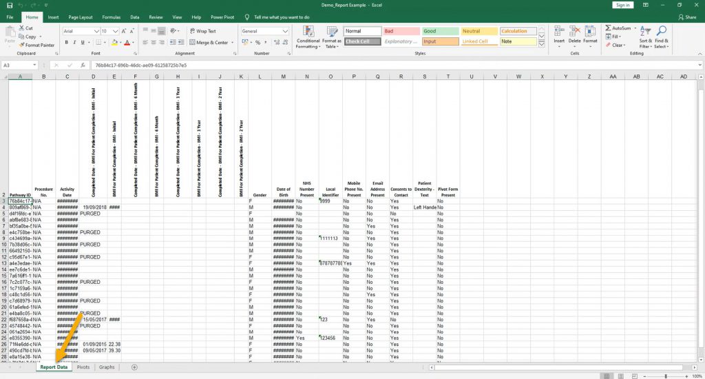
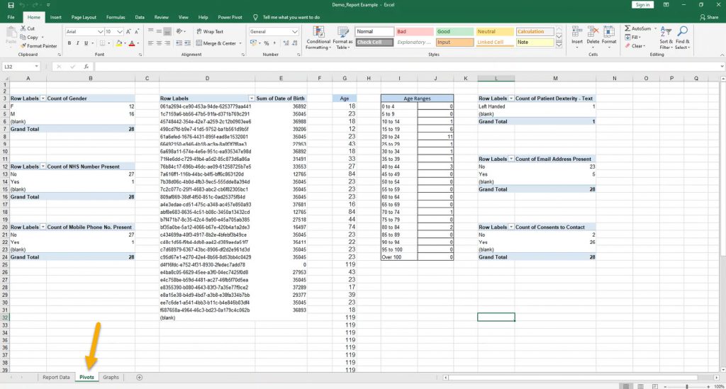
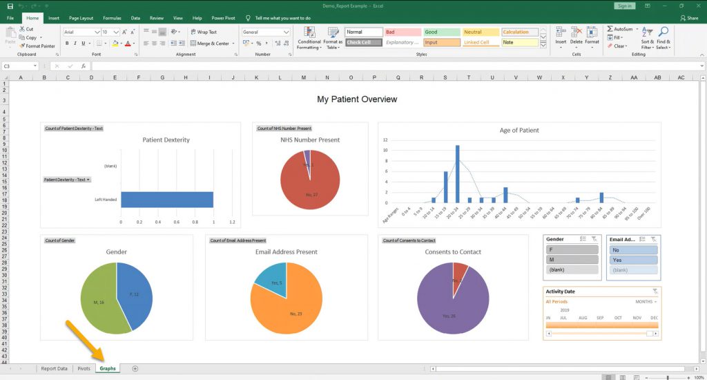
See above the Excel Workbook we formatted earlier. We have the ‘Report Data’ sheet which we gathered from a report we had built and run in Amplitude. A sheet with our Pivot Tables and some calculations and a sheet with graphs to display our data.
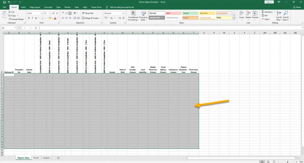
Before we go to Amplitude and upload the document, we need to clear the data.
Go to the Report Data sheet and clear all the information leaving only the column headings (rows 1 and 2).
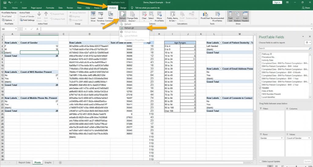
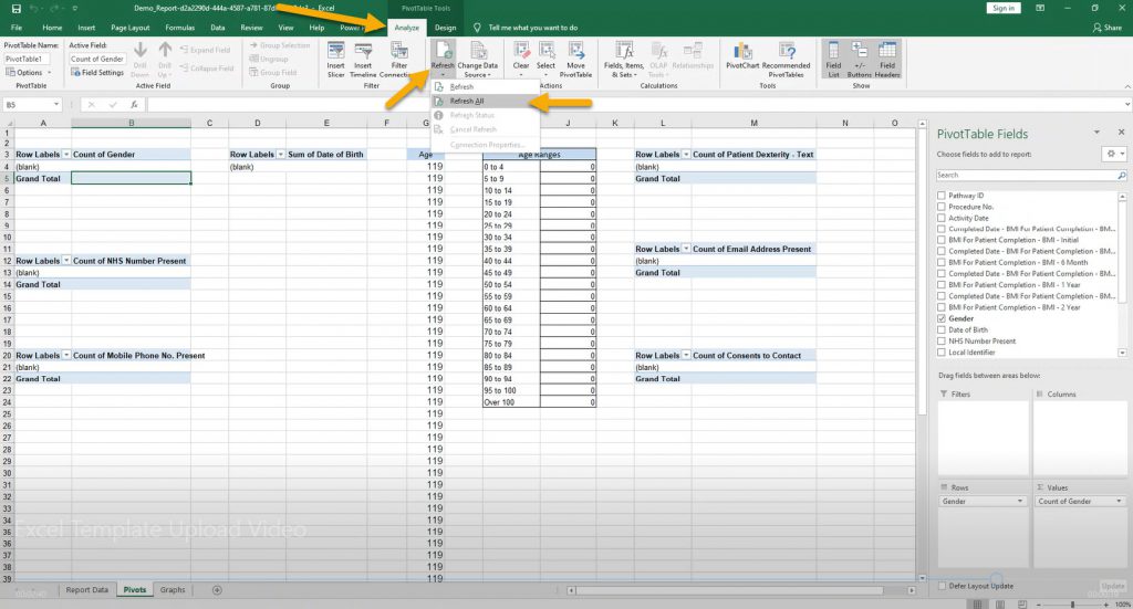
Go to the sheet with Pivot Tables, click on one of the tables to open the PivotTable Tools, click Analyze, then Refresh and Refresh All.
All the Pivot Tables should now be empty.
Save and close the document.
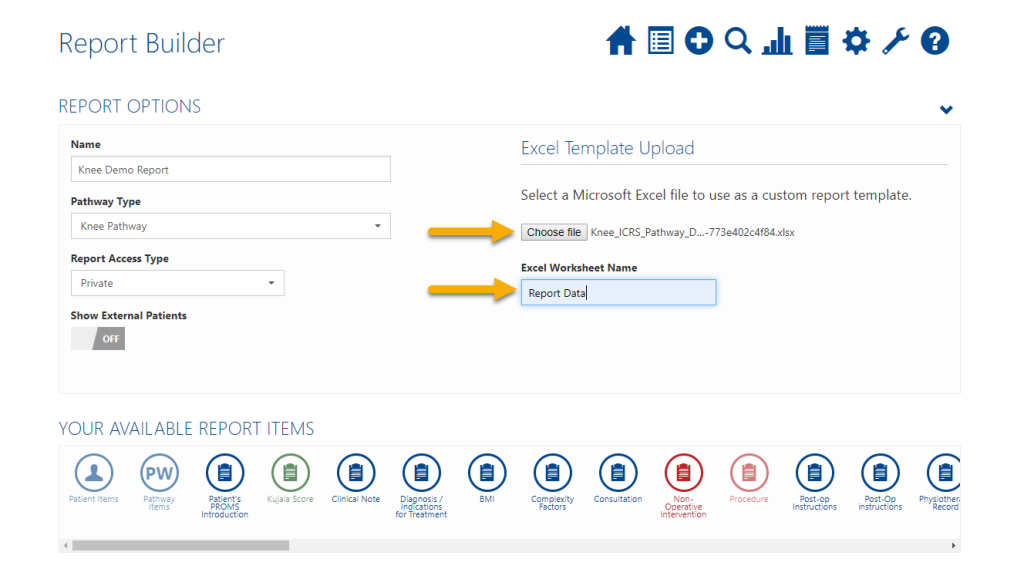
Click Choose File and open the document you just saved.
Then into the Excel Worksheet Name box enter the name of the sheet which had the raw data on, in this case it was Report Data and will normally be this unless you have specifically changed it. Bear in mind this is case sensitive.
Scroll down and click Save.
Next time you need the report, run it as you normally would. Download the file and open in Excel.
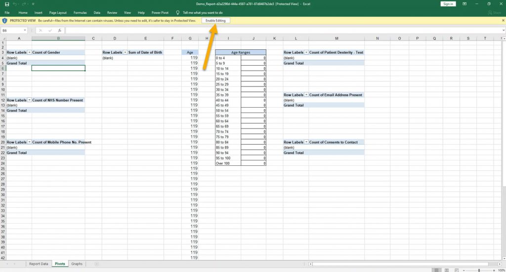
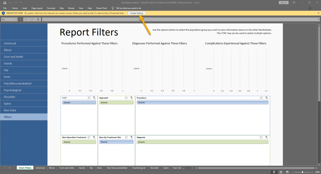
Click Enable Editing in the top yellow bar.
If you click the Report Data sheet you will see the data has automatically saved here.
Go to the sheet with Pivot Tables, click on one of the tables to open the PivotTable Tools, click Analyze, then Refresh and Refresh All.
The Pivot Tables should all refresh with the new data.
Troubleshooting: Pivot tables not refreshing properly
If the pivot tables do not fresh properly with the new data this is because either:
- The new data is causing the pivot tables to overlap – to solve this cut and paste the pivot table which is causing the problem to another space in the sheet and try refreshing again.
- The Report Data column headings have changed. This may have been caused by a system upgrade or a clinical change to the pathway. To fix this re-select the pivot table fields.
Microsoft Excel Functions to Help You Analyse Your Amplitude Data
Scrub up your Excel skills to make the most of the data you are collecting on Amplitude.
We know the Report Data returned by Amplitude can look daunting so here are some Excel functions which will provide a clearer picture of the data you’re collecting.
Filters:
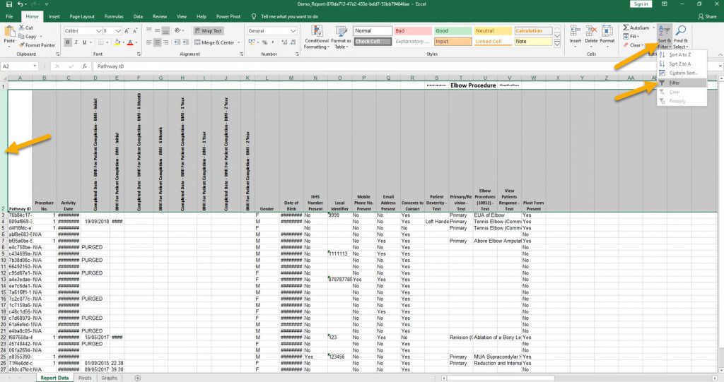
The Excel Filtering Tool is a simple feature but is great if you only want to view patients with a certain criteria e.g. only those with a procedure form or only male patients.
To use the tool first select the entire row with the column headings in (usually row 2) by clicking the row number.
Click Sort & Filter and in the drop down select Filter.
You will then see small grey boxes at the bottom right of each heading.
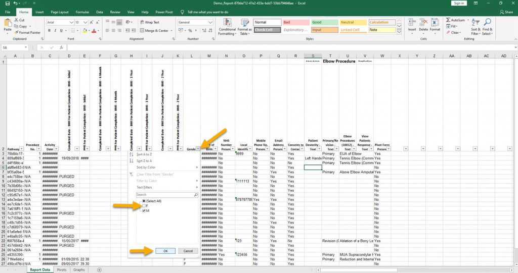
Click the box of the column you’d like to filter (e.g. gender) and de-select any items you do not want to see (e.g. female).
Click OK and those items should hide, in this case leaving only male patients.
You can then filter further or reverse this process by clicking the grey box again and re-selecting the items.
PivotTables:
Pivot Tables:
The first step is to create your report template in Amplitude, run and download the data; we will call this the raw data. To find out how to do this see previous guides in this section.
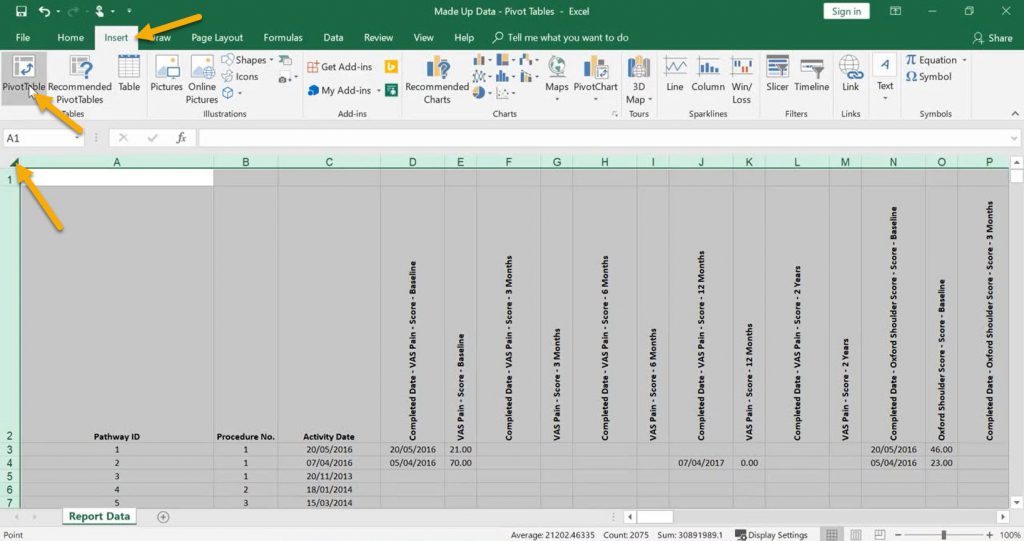
Select all the data by clicking the small box in-between the column letter ‘A’ and the row number ‘1’.
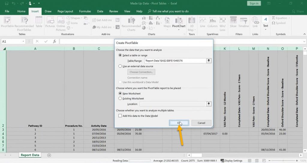
Click Insert and then PivotTable.
You will then see a blank PivotTable on a new sheet.
From this point on you can customise the table as you wish using the data you have and add more PivotTables.
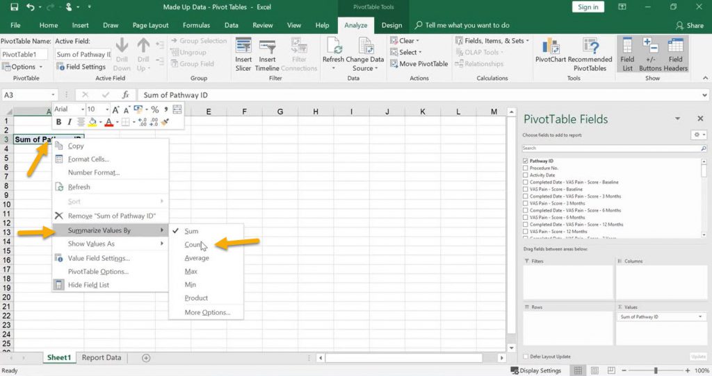
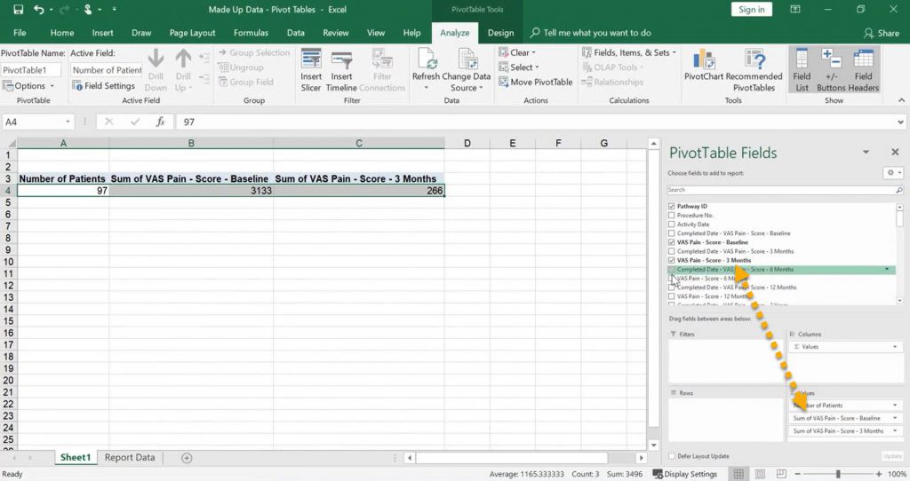
In this example we want to analyse our patients scores. First tick the box next to Pathway ID.
This has added the ‘Sum of Pathway ID’ to the table however we want the ‘Count of Pathway ID’ so we can count how many patients we have. To do this right-click ‘Sum of Pathway ID’, hover over ‘Summarize Values By‘ and click Count. This has now changed it to a count of our patients.
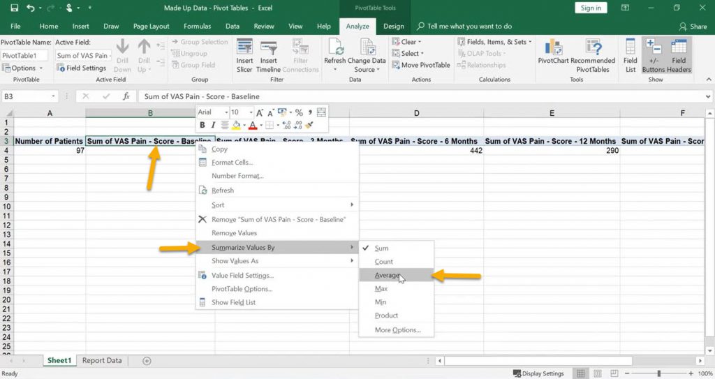
Similar to before, right-click the ‘Sum of VAS Pain – Score – Baseline’, hover over ‘Summarize Values by’ and click Average.
This will now display our patients average Baseline VAS Pain Score. Repeat this for each time interval of the score.
Now we have the figures, we can graph the data.
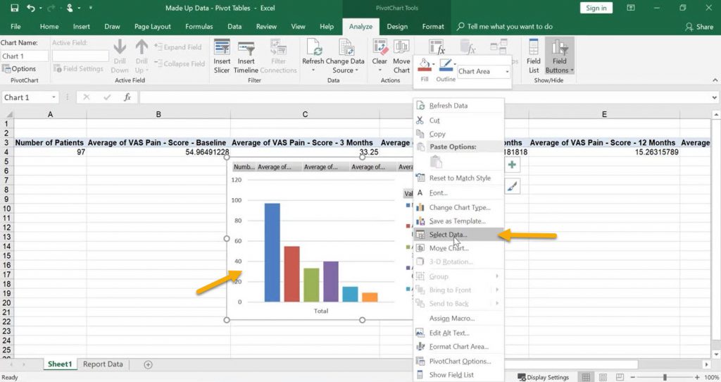
Make sure a cell you are in is within the PivotTable. Click Insert and choose the graph type. Here we have chosen a simple bar chart.
A graph will then pop up.
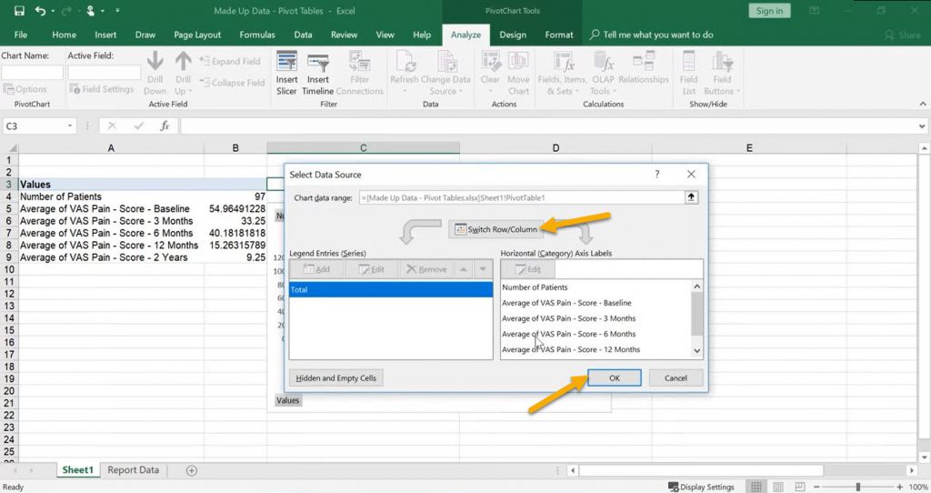
However notice our rows and columns are the wrong way round. To fix this right click on the graph and click ‘Select Data…’.
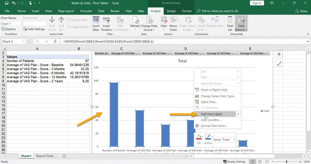
The graph is now fine to use as it is, however we want to add some data labels.
To do this right-click on the graph and and click ‘Add Data Labels‘.
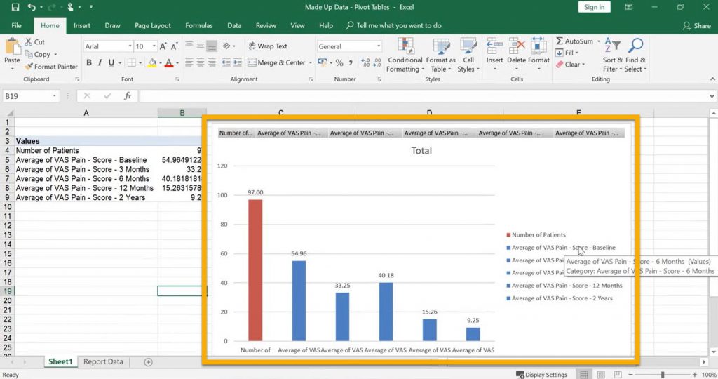
The graph can be customised as you’d like, here we changed the Number of Patients bar to a different colour.
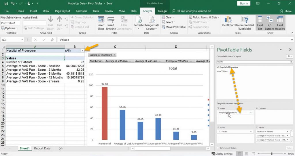
To further analyse the data we can use filters to see if certain variables effect our outcomes.
To do this first click on the PivotTable to open the ‘PivotTable Fields‘ box. Click and drag the variable (e.g. Hospital) into the ‘Filters‘ field.
You will then see the filter field above your PivotTable, you can repeat this process to add as many filters as you’d like.
Save time next time by uploading this file to Amplitude to use again. See Excel Template Uploads to find out how.
How to Use the Revalidation Report
Amplitudes in-built Revalidation Report provides you with a tool that allows you to see all your validated outcomes quickly and easily.
Unlike Private and Public Report Templates, this report only returns those patients with a completed procedure form and covers all pathway types. Due to the sensitive nature of the report it can only be run by the pathway owner themselves, no data will be returned if a delegate runs this report.
How to Run the Report:
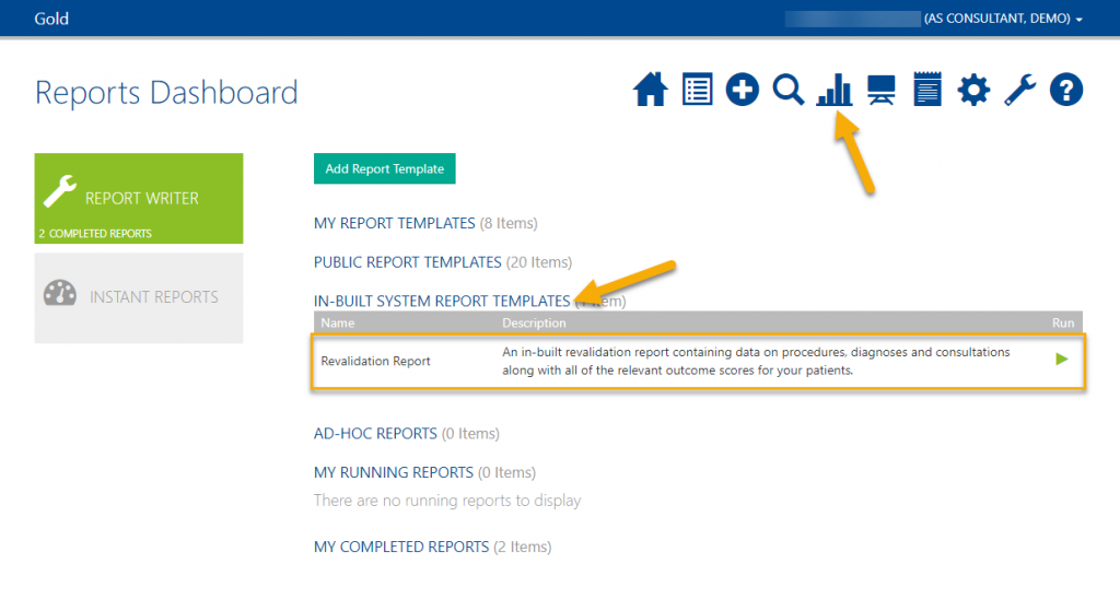
First click on the bar chart icon to go to your Reports Dashboard.
Click ‘In-Built System Report Templates‘ and here you will see the Revalidation Report.
Click the green play button.
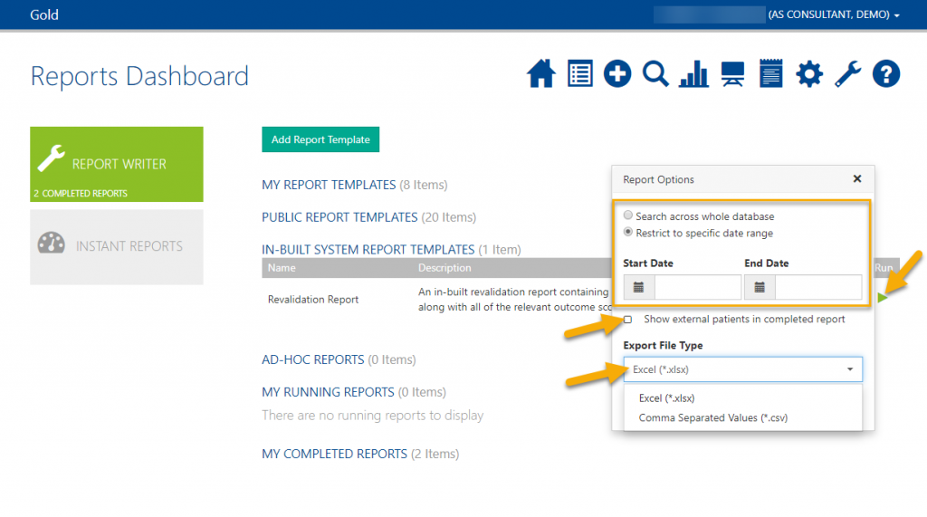
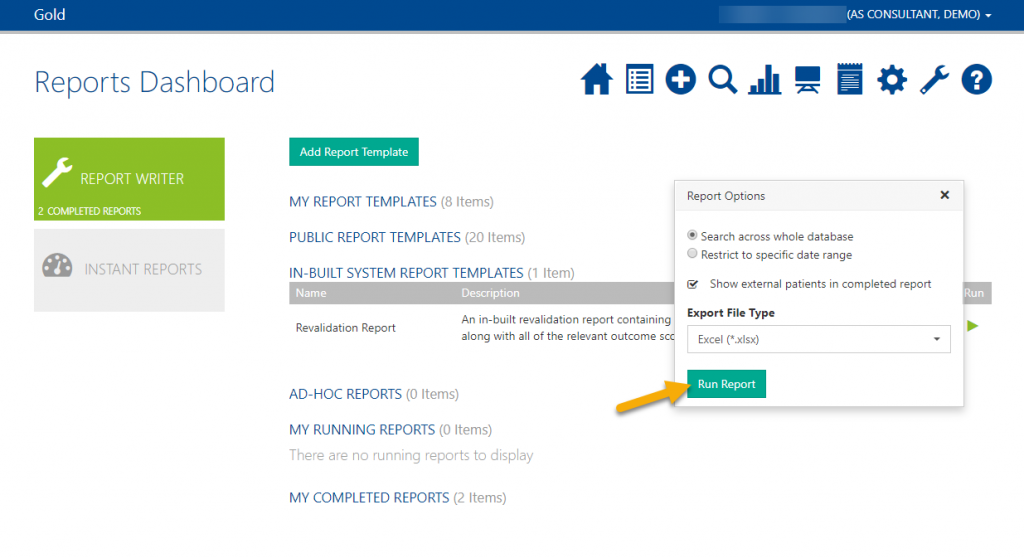
Choose a date range or to see all of your patients with procedures choose ‘Search across whole database’. If you choose a date range, bear in mind this works on pathway start date – not procedure date.
If you are running this report and currently data exchange from a pro one™ or pro enterprise™ account, check the ‘Show external patients in completed report’ box.
You can then choose to export as a .csv file or an .xlsx file.
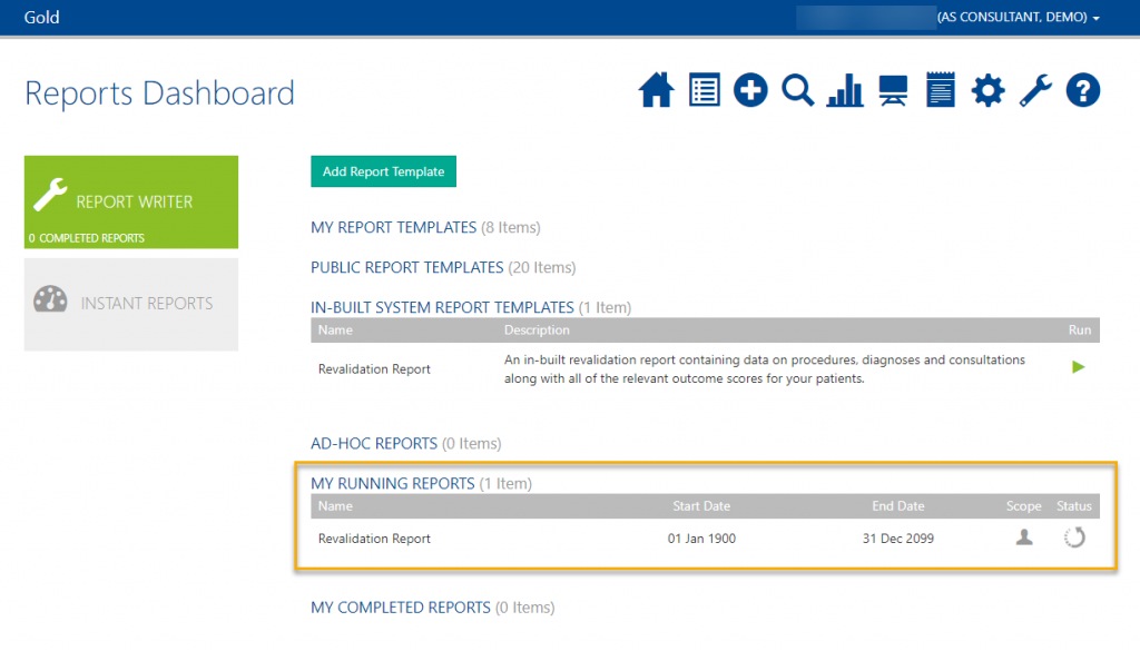
Whilst the report is compiling, it will sit in ‘My Running Reports‘ with a spinning arrow. The time it takes to run depends on the amount of data you have.
To view the report click the green download icon and acknowledge the privacy notice.
The report will then download and will be saved in your computers downloads folder for you to access.
Accessing and Using the Report:
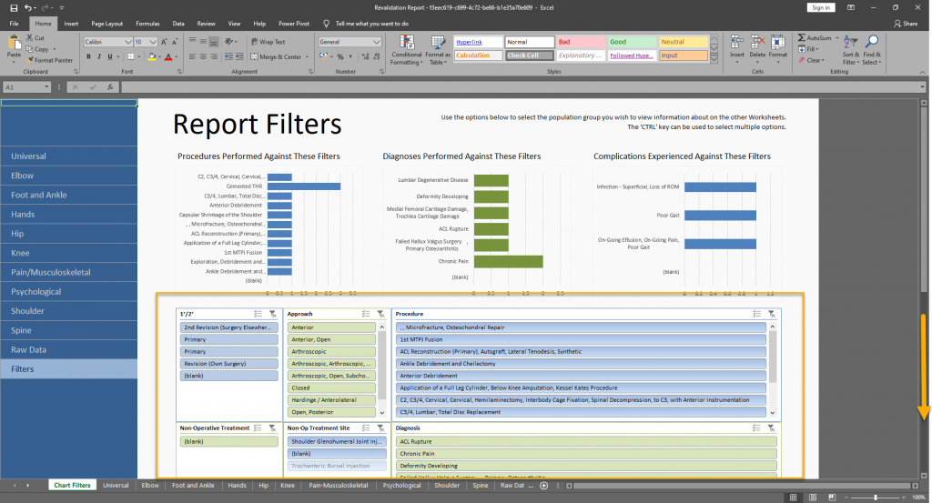
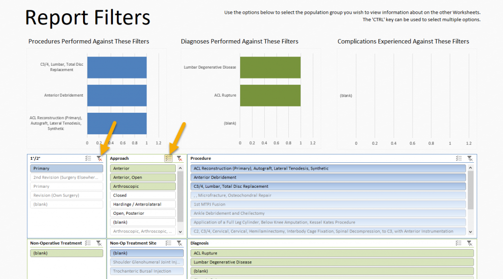
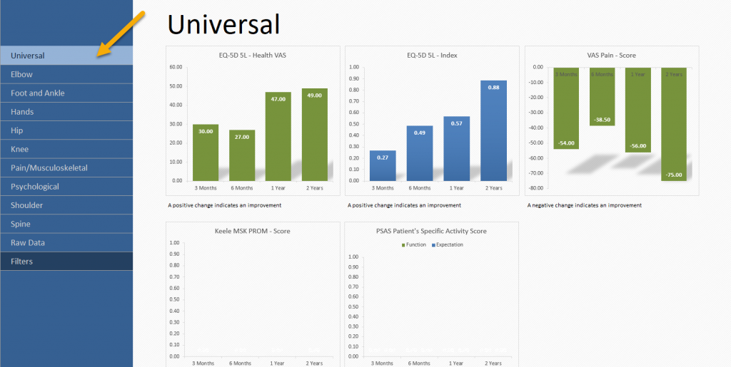
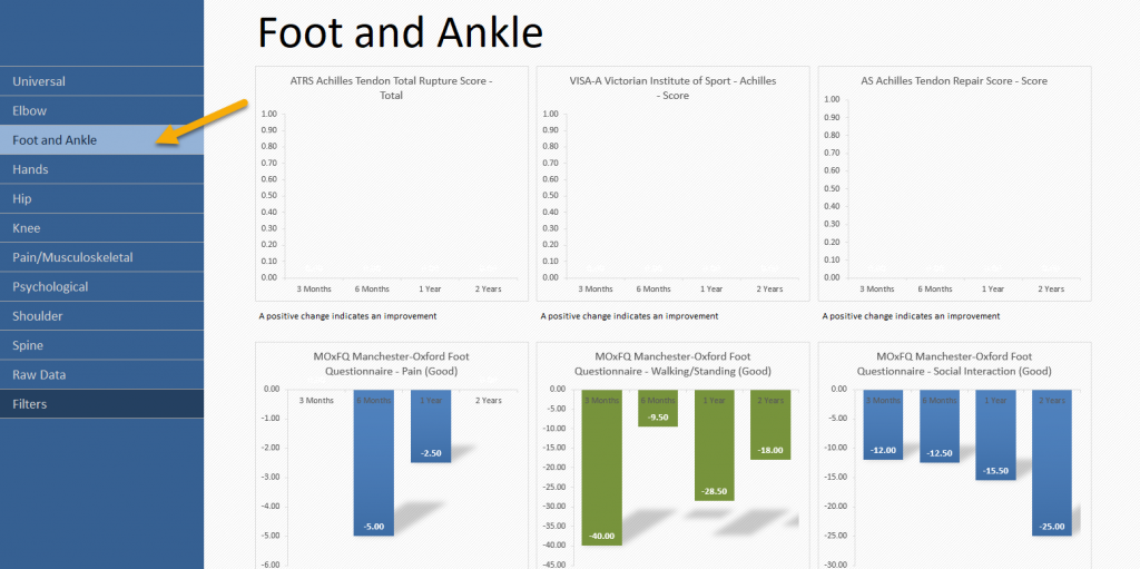
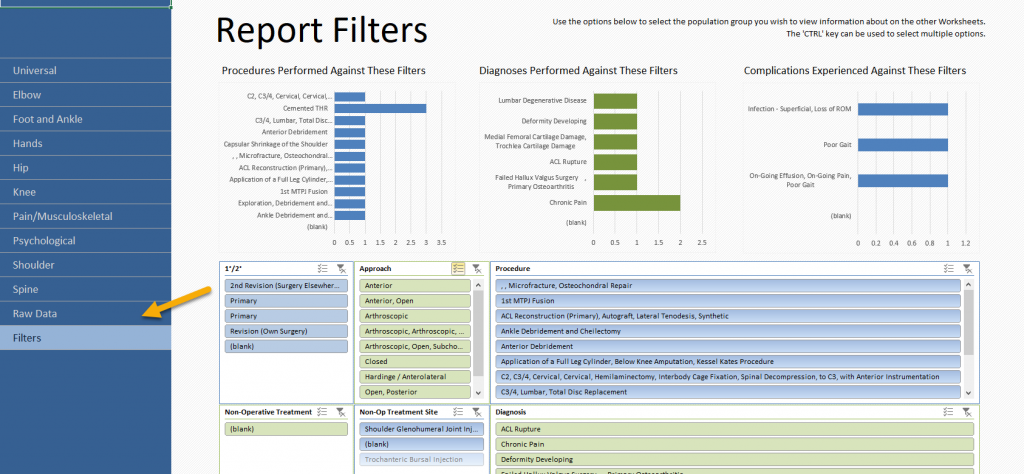
The document will open on the filters tab. Here you can filter by any variable returned in the report, such as Approach and Procedure Type. If you select a filter option, all graphs will instantly update to only show the outcomes of patients with that variable present.
If you’d like to select multiple items on one filter, click the multi-select icon.
To clear the filter selections click the red cross.
If you wish to see the outcomes of all your patients, you don’t need to use any filters.
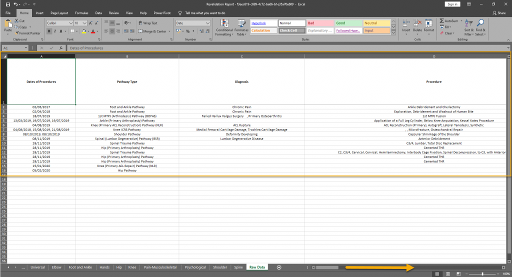
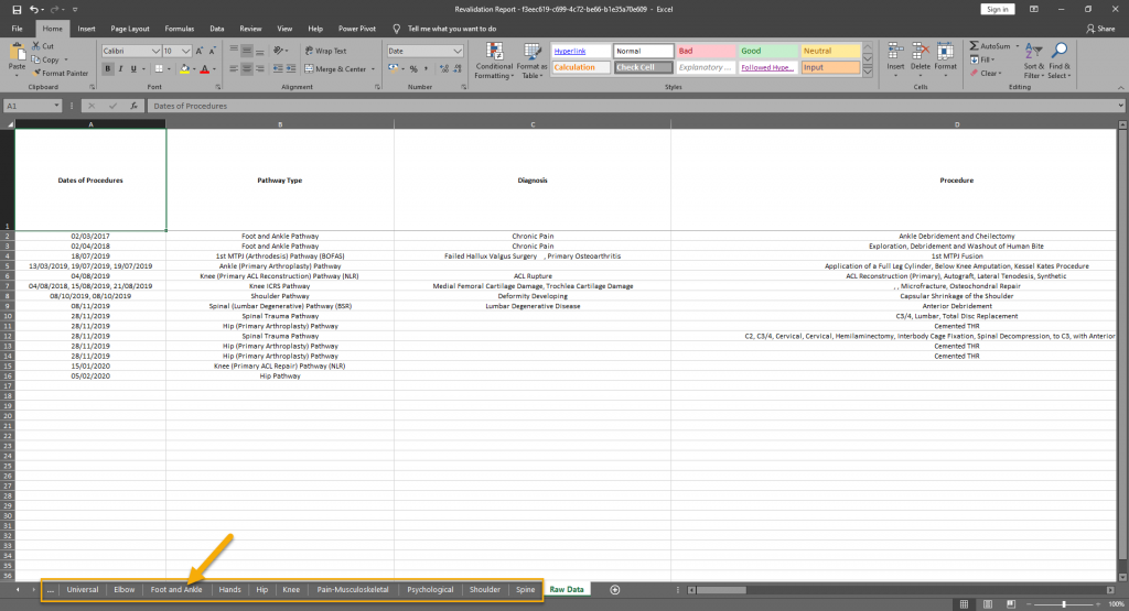
Here, each row represents a pathway. The columns range from procedure form items to score values.
Please note: This report does not contain any patient identifiers.
How to Save as a PDF:
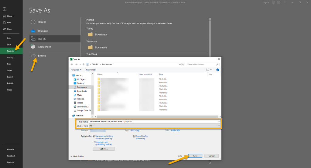
If you’d like to save any information as a PDF document, first make sure you are on the page you wish to save.
Click File at the top left-hand corner.
Go to ‘Save As’ and then ‘Browse‘ to find the location you wish to save the document in
Name the file something meaningful to you and then change the file type to PDF.
Click Save.
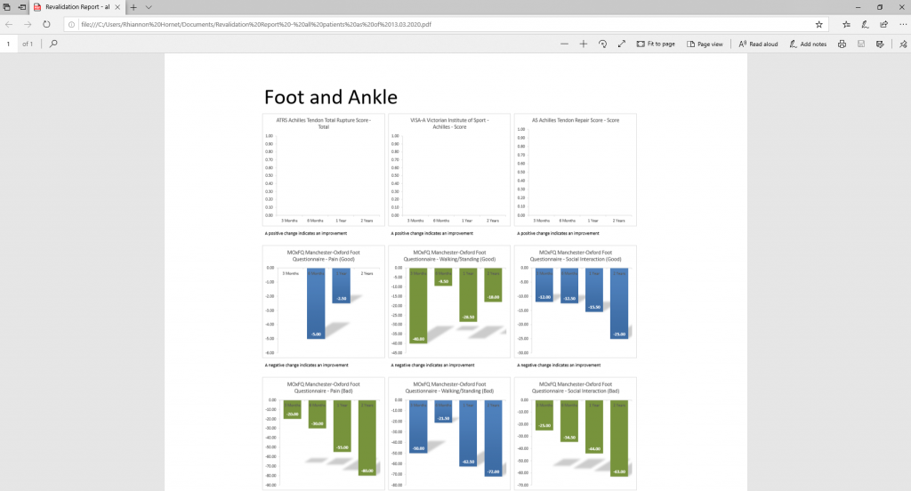
When you open the PDF file you should only see the information displayed on the chosen tab within the Revalidation Report.
Click below to download the help pages in PDF format:
Extra Report Builder Options and Pivot Forms

